Another approach to summarizing data is through visualization, i.e. using graphs and charts. In this section, we look at histograms, frequency polygons and ogives.
Histograms
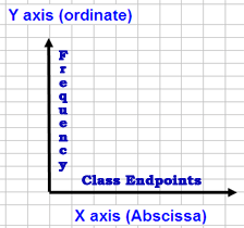
A histogram is a type of vertical bar chart that is used to depict a frequency distribution. Construction involves labeling the x axis (abscissa) with the class endpoints and the y axis (ordinate) with the frequencies, drawing a horizontal line segment from class endpoint to class endpoint at each frequency value and connecting each line segment vertically from the frequency value to the x axis to form a series of rectangles.
A histogram is useful for differentiating the frequencies of class intervals and quickly ascertaining information such as which Class Intervals produce the highest frequency totals.
The histogram can yield information about the shape of the distribution of a large database, the variability of the data, the central location of the data and outlier data.
Frequency Polygons
 A frequency polygon is a graph in which line
segments “connecting the dots” depict a frequency distribution. In a frequency
polygon, the Class Endpoints is scaled along the x axis and the
Frequency values along the y axis. A dot is then plotted for the
frequency value at the midpoint of each class interval (class midpoint).
Connecting these midpoints dots completes the graph.
A frequency polygon shows approximately the smooth curve that would describe a frequency distribution if the class intervals were made as small as possible and the number of observations was very large. The very common bell curve used to represent a normal distribution is an idealized, smoothed frequency polygon.[1]
